Are you expecting imagery from a new satellite within the next year or two? Or do you have a few years to wait? This first day provides a few points to think about and then answer two questions on what satellite you are familiar with and what characteristics you like the best. On Tuesday, we'll add another brief aspect. We'll be searching for the familiar in the unfamiliar or is it better described as the unfamiliar in the familiar?
Bernie,
I really like the slides you made for Day 1! It caught my attention to read about your experiences, and how you in the past had struggled to bring the new satellite data into weather offices and help people start using them.
I remember the change from Meteosat First generation to Meteosat Second generation here in Europe in early 2000's. Suddenly a lot of new data and products was available. But still years after the satellite was launched, I saw in many forecasting offices the same old products running. Some forecasters were really surprised when they saw new products that could help their work.
We are doing a good job, if we can shorten the time from the new satellite products being available to users actually using them.
Dear CALMeters, great if you take couple of minutes to fill in the survey #1 Bernie has made available - only three short questions to answer. The survey you can find here: https://classroom.eumetsat.int/mod/questionnaire/view.php?id=7132. We really appreciate your time.
Warm regards,
Vesa
Hi Vesa,
Thanks for bringing up some very good points! The forecasters kept using the imagery and tools that they were most familiar with and it took training or some other person or catalyst to introduce them to something new.
The responses to the survey are coming in. You can view them as well. If you’ve already taken the survey, you can go back and look at other responses. If you haven’t taken the survey, it will be open all week. Oops, I realized that I forgot to mention which end of the scale was a high rating and which end was a low rating – it is fixed.
I see that one comment reflects on using RGB (Red/Green/Blue) image combinations for viewing imagery. That is one way to take advantage of combining information from many channels. We will talk about that specific topic later in the week.
For today, we will touch on an aspect that we have right now: The satellite will not launch for another year and the forecasters are busy. How can we get them to look at information and examples now? What is the best way to present the information?
On the agenda today is a short briefing and another short survey “Do you like lists, images or graphs?” I recommend that you view the examples before taking the survey. The best way to view the spectral graphs in the pdf is full page – so you may want to download them to do so.
Check this out on the session page! https://classroom.eumetsat.int/course/view.php?id=226§ion=4
I’m looking forward to more input!
Bernie
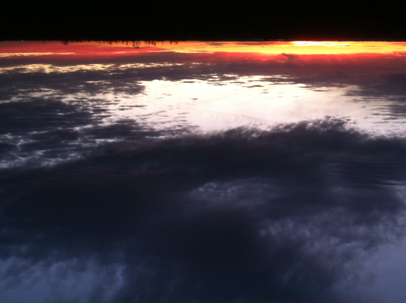
PS - we had a beautiful sunrise
Update for day 2: In the survey, the graph is ahead in terms of presentation and providing better information. You can still share your opinion if you have not done so. Responses to how to encourage curiosity include showing examples where the new product improves the forecast as well as have new products that are intuitively understandable and not a lot of work to use. Can you think of other ways to encourage curiosity?
And now on to day 3 activities: View multiple graphs comparing the channels on various satellites across the globe and “Image + Graph” example combination.
For the briefing today, go to this web page: http://rammb.cira.colostate.edu/training/rmtc/newsat.asp
For the “Image + Graph” example, I’m trying out the padlet ;)
You are welcome to contribute answers to the questions on the padlet!
http://padlet.com/bhconnell/xgjtzwaf9yc3
You can also contemplate these questions: Does the graph take on more meaning when you combine it with an image? What other information can you get out of the graph? The broad band measurement gives one value whereas the spectra gives multiple values. When might this be very good and when might you have to make sure you remember it is more of an average? This information might be helpful for all types of forecasters. It is another way to visualize relationships or differences between channels. It will help experienced satellite users connect their well-used “standard” imagery with information the new channels will add.
Looking forward to more comments!
Have a great day
Bernie
Good morning,
I filled the survey Day 1 yesterday and only now noticed that 1-is the highest rate, and 5-the lowest. Sorry I mixed and put my answers in oposite way:(
Izolda
I did the same as Izolda, but I guess, that at that time nothing was mentioned about the meaning of 1 and 5.
Piia.
Hi Izolda and Piia,
When I saw one of the responses yesterday, I realized I had forgotten to tell what the scale was and that is when I added some extra text. That is why you didn’t see it the first time Piaa ;) I’ll grab the responses and generate a newer graph today (after I take care of a different fire drill here at the office). Thanks for letting me know.
That brings up some points we all can relate to: I’m new to moodle and it has a lot of features - we often miss something the first time because we were paying attention to other details. It’s like doing a weather briefing for the first time or playing learnopoly online for the first time or putting on a webinar for the first time or preparing for a new satellite…. That is why it is good to get more information, develop a checklist and practice!
Another point: When I was first introduced to the imaging spectrometer plots (also known as hyperspectral) they were presented with inverse centimeters on the x-axis, and temperatures going from cold to warm on the y-axis. If you wanted to put that in the perspective of the atmosphere and the imagery channels on GOES, you had to reverse both of those pieces of information in your head. That is what was done with the graphs – the information is being presented differently for a different audience.
For others - The surveys are still open and you can check out the brief here (or from the CALMET page as well):
http://rammb.cira.colostate.edu/training/rmtc/newsat.asp
and the padlet here:
http://padlet.com/bhconnell/xgjtzwaf9yc3
Bernie
I see that Vesa provided some good answers to 4 of the 5 of the questions on the padlet example! I added a few more comments. Anyone else care to look at the graph and questions and give some answers to the questions for the "remote sensing basic course"? One of the questions has to do with why one of the lines has points above it while another one does not. Remember - each of the two series of points on the graph represent the spectral information from ~3.6 µm to 15µm for one pixel that has a footprint of ~13km x13km.
From Vesa, I wanted a clarification of your other point - "This graph has a lot of information and takes time to understand the inverse temperature scale at y-axis." When you say the inverse temperature scale, do you mean from what is normally presented in a Remote Sensing Class or what might be in the research literature? Or in some other sense? I set the scale this way following the "general" atmosphere - warm at the surface and colder going up. The surface and high cloud points were chosen as bounds.
Check out the padlet: http://padlet.com/bhconnell/xgjtzwaf9yc3
Bernie
Today I'm looking for comments on the use of RGB's
With GOES, we have had 5 channels, and simple has been viewing an individual channel and complex has been viewing a combination of 2 channels (for example a brightness temperature difference).
With 16 channels coming in a couple years, we keep hearing that viewing RGBs will help “condense” the information. (RGB represents Red/Green/Blue image composite). We have looked at many RGB composites and produced them with MODIS and VIIRS imagery. The reactions are mixed.
Initially, much of the training I saw coming out of EUMETSAT in terms of Best practices for RGB was here is the RGB image, this color represents low cloud, this color represents high cloud, this color represents snow, etc. Now as I scan through available materials, I am not seeing the same focus. I’m seeing more explanation of why. I’m also seeing something I already came across: when describing how an RGB is made, start with a simple example first – one channel per color. Then move on to describing the more complex ones. Is this a correct observation?
On the first survey, Lada Gabela Seperic said “We are using satellite images (especially RGBs) to detect (and track) different features i.g. Cb clouds, fronts, fog ... I would say that my job would be very much difficult without them :)” Which are your favorite RGBs and how long did it take you to adjust to them? Are they simple RGBs or complex ones? What advice would you give to a “beginner”?
What do you think?
Bernie
Hi Bernie,
I have been following your session with great interest. I really enjoy seeing how you are using Padlet and other low bandwidth tools to teach about these new satellite tools, and demonstrating HOW WE MIGHT teach about them in ways that generate curiosity to learn more. The graphical tools you use to demonstrate the different satellite capabilities are very effective, and efficient, at revealing the advances the new satellite will offer.
I wish my operational knowledge was higher so that I could respond to the challenging questions, but I appreciate seeing the design of your lesson.
Thanks!
Patrick
Bernie, nice that you opened up the RGB topic, too.
We just had an online briefing (webinar style!) this morning, you can view a little RGB applet we used for comparing four different RGBs in Europe. Quite neat and easy for RGB analysis in a classroom or even in a webinar.
My favourite RGBs is the night Microphysical RGB. It makes detecting those night-time low clouds so easy.
(If anybody is interested to use the RGB applet, let me know, I can send you the super simple code).
hello, Vesa,
yes, it would be interesting to look at RGB applet. Send please.
Izolda
Izolda, a pleasure.
You can find the applet files in the attached zip file. Download it, replace the four images with your own images and edit a tiny bit the jquery.min.js file (instructions in readme.docx), and have fun.
Kiitos:)
Thanks for this daily dose of Satellite Meteorology, Bernie!
I took a challenge to put myself into a position of a satellite course learner, and answered some questions in your Padlet. it is awesome to see the amount of information that you can find in one single graph.
This helped me to realise that your set of graphs for VIS and IR spectrums will be just enough for a good learning session in a satellite classroom. What I will need is simply to make a printout of the graph, make questions similar to what you did, and let the people suggest answers, and then develop a Socratic Lesson out of it :'-)
And all I need is one graph and a bunch of good questions. Big thumbs up for your guidance, Bernie.
Friday - and Happy Halloween to those of you who celebrate it!
Thanks Vesa for your comments on the use of RGB and the applet - I have downloaded it too!
Today, I'll try to connect to various points from throughout the week.
Someone mentioned earlier in the week that it is easier to understand new information and products if it is intuitive. I'll argue that intuitive includes capabilities that we are born with as well as learned capabilities. And... we don't always fully realize that we have learned new things: it is subconscious and picked up when we repeat the process day after day - like looking at imagery over your area. I know some people that can detect the initiation of blowing dust very quickly in visible imagery and then also confirm quickly with a glance at other products.
Being aware of the 'assumptions' of the imagery can help us understand it better when we use it everyday. The graphs we have looked at highlight 2 AIRS pixels. Looking at the high spectral resolution is like having a magnifying glass. As we look with the magnifying glass, we see a few of the features we encounter when we look at our own geostationary imagery.
On the padlet, a comment from Izolda tells me that I should try to include more imagery to help explain the various features better. For me, it is easier to explain these graphs in person at a computer where I can quickly bring up an example to show a feature. It is harder to do that asynchronously (but I will work on it!)
T the beginning of the week, I said we would focus on GOES, but I have brought in imagery from POES to help out. Today's examples are similar. Has anyone used the presentation software Prezi? It is similar to the padlet in that you can put things on a canvas and then arrange them in a story. It is a bit more structured and has a higher learning curve ;|?
Take a look at this slide show with embedded comments.
http://prezi.com/qyjxg3kqec3e/?utm_campaign=share&utm_medium=copy&rc=ex0share
Click on the right arrow at the bottom to start moving through the presentation. The left arrow will take you back a step. You can use the blue button on the slider just above the left and right arrows to jump to different "slides" within the presentation.
If you would like to try your hand at editing, I can give you editor privileges. {In order to edit, you will need to have a Prezi account - to get access to the free version click the sign up button at the top of the presentation window. Then, send your Prezi account name to me at bernie.connell@colostate.edu }
Comments or questions are welcome!
Have a great weekend!
Hello,
this training is very busy and a big challenge. We need to concentrate our attention at content and also learn how to use a new sofware...It was a new way of presentation using Prezi. Easy to rule of seperate slide and all image in one view as well...Thanks for introduction!
Izolda
Nice Prezi ! I like to see the overview in the beginning, and then go through the presentation path. A usual Powerpoint feels more straigthforward and linear compared to this.
Our activity this week will take a glimpse at data access and display. Some of us are in institutions that have great access to data and imagery as well as software to display and manipulate it. Some of us do not. This is not a new issue. With a new satellite and lots more data, what will we do? Look through the 6 slides – I recommend using the present mode with speaker notes. In particular, for slide 6, if you have any comments on the 2 questions there, let us know!
Oops - Sometimes when we are very familiar with a topic, we forget that others may not be familiar with it. If you looked at the slides and wondered what GEONETCast was, here is a good link to find out. Note there are 3 different broadcast streams across the globe.
http://www.eumetsat.int/website/home/Data/DataDelivery/EUMETCast/GEONETCast/index.html
Something else to think about before we end the week tomorrow: On the graphs from last week
http://rammb.cira.colostate.edu/training/rmtc/newsat.asp Did you notice a part of the spectrum was missing to help us understand all the current and new channels? What part is that? How did that happen? ..It has to do with having a limited budget and having to “cut some aspect”. Is there another sensor in space that captures these missing regions?
My initial intention for this second week of the session was to have you grab an image for a feature of interest, grab a corresponding fine wavelength spectrometer image (hyperspectral image), and then use a free software to generate a spectra for the feature of interest. The only free software that I know of capable of generating the spectra (Hydra), presents the spectral graph with inverse centimeters on the x axis – not the way I want it to be shown. (and it’s not a high-priority aspect to change :(
If you are aware of another free or low cost software that can help do this, please let me/us know!
Similarly, if you have a data access or display problem, let us know. You never know when someone will have the answer you need.
Regards,
Bernie
I just went through the topic Bernie developed and I liked very much. She make it look simple even though is not. I liked the way she presented and the tools used. This is my first experience with CALMET on line. I liked very much the combination of graphs and images she used and the comparison of the channels of different satellites.
I didn't see people from South and Central America participating in these sessions. Maybe I didn't it look enough. Many of these countries use GOES extensively and need to be prepared for the changes they will be facing very soon regarding satellite images in these regions.
Thank you very much Bernie for introducing me to this new way of learning.